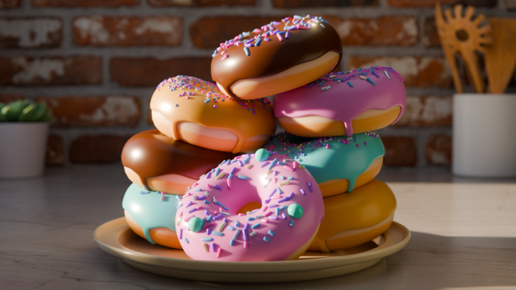
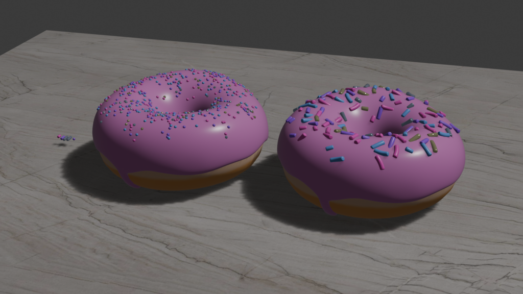
This is it. The final update. Since this is my last Blender post for this learning project I will present to you my finished render! The culmination of my many (many) hours of work that went into this beautiful donut stack.
Now with depth of field.
To present my final post, I have screen recorded myself in my donut file and demonstrated a bit of what I learned. It’s crazy looking back on the first update and seeing where I started to where I’ve come. It really makes it all seem worthwhile because I have attained such valuable 3D modelling skills through this experience. Thank you, for following along and I hope you were able to learn something along the way!
Today we talked about the future! And what kind of world we predict we will be teaching in years down the line. We did an activity where we wrote down our predictions on a sticky note and shuffled around the class, swapping notes with people until the music stopped. Then we would read the sticky note we ended up with, and on the back of it, we would write down a rating out of 5. This activity was really fun! Some sticky notes were very optimistic about technology and it’s rapid advancement, while many were very nervous and even pessimistic about the direction we were heading as a society. I believe, even for us, these types of tech classes are important so future teachers are less nervous about including tech in their lessons. Many students are extremely interested in technology and there are so many fun ways we can include it in our classes for them, so I feel that by straying away from it because a teacher personally feels nervous around it and how it *might* negatively affect our futures, it would be robbing children of that opportunity to learn more about it and how to use it responsibly. Technology as it stands isn’t perfect, and there are definitely risks involved, which is exactly why it’s so important to educate students on safe and responsible use of it while they’re young! Aside from these views, it was fun to picture what a futuristic world might look like.
Image by nattgw on Unsplash
We also discussed how Australia has recently implemented a ban on social media usage from children under the age of 16. There were mixed opinions on this in class, but many seemed to favour the decision. Below are some news articles and opinion pieces I found about this!
With that completed, this is the final reflection post I will make here as term has concluded. I’m grateful I was able to record all of this for future reference!
This Blender session was pretty chill. It mostly consisted of minor changes to make the overall scene more aesthetically pleasing. I ended up skipping the animation part of the tutorial because I felt like for what I was learning and what I set out to do with this inquiry, that animation could be another facet of something a little farther down the line. Animation would be fun, to be sure, but at the moment I’m content with learning how to model and how to set up and render a still scene. And so, thus began the process of finalizing my scene and checking for mistakes.
One of the first things I did was look at my face orientation. To do this, I opened my Viewport Overlays drop-down and selected Face Orientation under Geometry. Anything highlighted blue is correct, but anything red is facing the “wrong direction.” This may be kind of confusing, but for example, the inside of my cube was red because Blender thought that the outside of the cube is what would be facing the camera rather than the inside faces. This is an issue, because anything highlighted red in this mode is likely to have incorrect shading. To correct this, all you have to do is select the whole mesh in edit mode (by clicking it and hitting A), hit Shift+N, and tick the box in the “Recalculate Normals” tab that opens up to invert the colour to blue. This lets Blender know what the correct face is that will be facing the camera.
The red faces wouldn’t have had much of an effect for this piece, since they’re out of the render frame anyway, but it’s still good to know how to correct this!Fixing the issue. Note the box in the lower left corner.
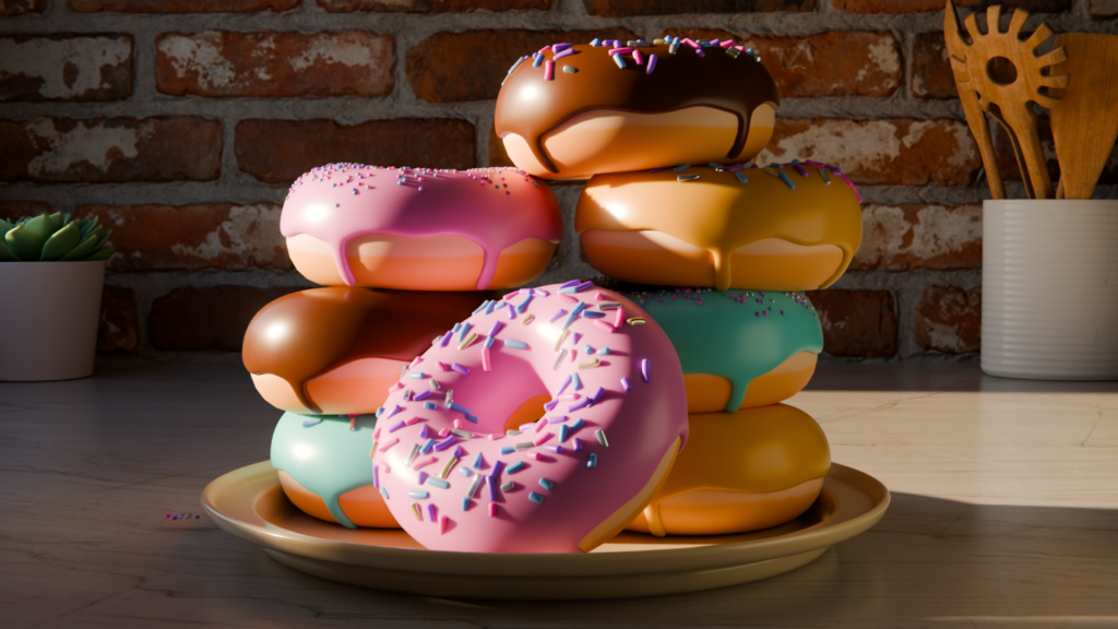
Following this, I reoriented the donuts to look a little more dynamically stacked on the plate, added some more decorative sprinkles to my front-facing donut, modified the exposure range of my scene (by selecting False Colour in the Colour Management tab), shifted my render camera up a bit, swapped a few of the icing colours, and then… I hit F12 to start my render. It’s currently rendering at the moment, since this process usually takes a while, but I will leave you on the edge of your seat for now and you can look forward to seeing my masterpiece in the final blog post! Below, I’ve included the video by Blender Guru that I followed for this part of the tutorial.
For this session, I followed two tutorial videos instead of one. Working off of my last update, this session was all about the environment, ambience, and general lighting and composition. To start, I got rid of the bright light source from my last update and replaced it with one that mimicked the lighting form the sun in real life. Blender has a feature called “World Properties” where you can add in a sky texture and a sun. From there, you can modify the sun’s position in the sky, size, rotation, and intensity. It’s default settings are accurate to the real world (including it’s size relative to Earth) and you can play around with it to fit your desired effect.
Sunset in the void.
Problem was, even with the intensity turned down, the scene still felt very bright and didn’t match the lighting one would see in a real world kitchen. To remedy this, I added a cube mesh to surround my scene and carved a window into it. I did this by hitting I on the leftmost face of my cube to select the middle of the plane and hitting X to remove the middle of it. I then used vertices select and G to move the edges around to where I wanted them. I also had to make the rightmost plane completely black to avoid the light from the “sun” bouncing off of it onto my scene. After this, I added an area lamp (with low intensity and a yellow tinge) to gently hit the dark side of my donuts because in most houses there are usually other lights that affect a scene from afar, and this replicates that without being so harsh.
I also learned how to import add-ons to Blender. Blender Guru’s website, Poliigon, has an add-on that allows for the quick and easy importing of models and textures right into your Blender scene without having to go to the website in a web browser. This saves the hassle of downloading, unzipping, finding what you need when importing, etc. By hitting N, I can open a tab with a quick search feature that shows me what I can put into my scene. Using this, I imported a couple of decorations into my “kitchen” scene: A set of wooden utensils and a succulent. I also changed the backsplash from quartz to a brick texture that I liked because I felt like it made the scene a little less bland and a bit more homey. Below, I’ve included a link to the video that went over all of this!
The next video taught me about the compositing tab! This tab allows for more precise modifying of how light interacts with the materials in a scene. In this case, I used it to add a bit of lighting bloom and glare in my render. To do this I used more NODES. I’ve learned that you use nodes A LOT in Blender but they have so many uses and can do so much for your scene I can’t imagine not having them. There were multiple steps to the process of adding glare, and I’ve left a screenshot of the required node setup below.
It’s a bit blurry, but the information is readable!
I then went to my render options and played around in the colour management tab. This allowed me to modify the overall lighting of my scene, which I made a bit more saturated to give it a warmer tone. Following this, I also added a bit of lens distortion to my render camera to mimic a real-life camera. While it’s a subtle difference, it’s one of many small features that add to the overall sense of realism. The lens distortion was done with the nodes in the compositing tab again. I’ve included my final node setup below along with how the render looked before and after the addition of the nodes! All of these small changes combined to make quite the improvement!
Before and after! GIF made using Canva.
And with that, I’m done for today! I only have a few more videos left in this comprehensive Blender tutorial and I plan to finish my Inquiry with the final video. I will make a video at that point to showcase my final result and demonstrate my learning! It has been incredibly fun and I’m so glad I chose to learn Blender through this playlist! Below is my final render of the day and the second video I used for this post.
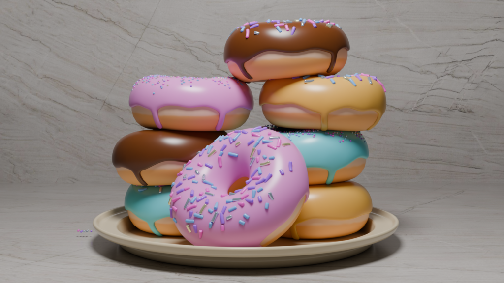
I made the brick texture in the background bigger to match the size of the donuts, but because I scaled it up, their resolution is a bit lower than the other elements in the scene. I believe the very final render will have the background blurred though, so this shouldn’t be a problem!
In this session, I made the plate that would support my donuts. Then, to make a stack of donuts, I duplicated them a number of times and rotated them so they wouldn’t look the same. I also leaned some at slightly different angles to make the stack look more natural.
For the plate, I made a simple circle and used the “vertices select mode” to rise the edges up. After jutting out more faces from the risen vertices (to give the plate a risen edge), I bevelled the edges and applied a solidify modifier to give the plate thickness. I rounded the edge of the plate (held C while bevelling edges so as to give it the perfect rounding) and gave the plate a shine and a touch of colour to make it look more realistic.
Rising the edges of my plate.
Following this, I made my stack of donuts. Blender Guru made sure to tell us to face one forward so it was easy to tell they were donuts, since the camera for the rendering will be showcasing the donuts from the side. Here are how they turned out!
After this, I wanted to vary the types of donuts since they were all the same colour. I swapped the types of sprinkles on each donut in the modifier tab and changed the colour of the donuts in the material tab. I moved the light source to the front and got a picture of where I’m at so far in the tutorial, and I am extremely happy with how it’s looking thus far!
Big emphasis on the plate as I am very proud of how it turned out! Also, please ignore the magic floating sprinkles off to the side!
Below is the video I used for the tutorial at this leg in the journey. Once again, credit goes to Blender Guru for his amazing work and I am very excited to look at the next final steps in his playlist!
Today I was able to give my sprinkles some colour and learn how to light a subject properly! Honestly my biggest takeaway from this session was how big of a difference lighting makes in the render. It’s honestly night and day.
I linked the materials of my sprinkles together to make the colour and shading settings apply to all of them, and also learned about a couple of new nodes. I used the Colour Ramp node to to assign colours to the sprinkles and the Object Info node to randomize them on the donut. Now, in terms of the actual donut, it’s DONE!! The following steps were about rendering and how to make the donut look pretty.
Donutttts
Finally the rendering process can begin. By default, Blender uses a program called EEVEE to render, which is the fastest, but it also creates the nastiest looking render known to man. SO, instead, I switched from EEVEE to Cycles which essentially renders it in real-time in the viewport. Cycles makes the render much prettier, but it works much slower. When the viewport is moving, the objects appear pixelated and choppy. When you stop moving the viewport around, it gradually sharpens. Below is a comparison between EEVEE and Cycles.
A nasty, dark, blurry shadow EEVEE render.Cycles as the viewport is moving. Oof.
To minimize pixelated choppiness, I switched from my CPU to my GPU for rendering and ticked the “Denoise” option for when the viewport is in motion. Switching to my GPU made the process much faster, but it’s still only moving at the speed of what my laptop’s Apple M1 Pro chip is capable of. If I ever wanted to upgrade, Blender Guru brought my attention to one site where Blender users can label which chip they’re using and how fast it renders their scenes. This information can be found on Blender’s Open Data Benchmark page and essentially ranks the top chips available on the market.
With rendering settings in play, I learned a bit more about how to use the camera. Specifically, I learned about a feature that allows you to control the camera and viewport as if it were a video game. Hitting Shift+~ (tilde key) allows you to move around with the WASD keys. Once you like where your view is at, left clicking once will exit that mode. For people who are accustomed to gaming on a PC, this makes moving the camera around a LOT easier.
Next up was lighting. When light hits an object in real life, it scatters it a bit inside before leaving the object again. Sometimes, this bounces that light onto the surface of objects close by. To replicate this, I applied subsurface scattering to the icing of my donut. This made the lighting appear much softer and gave the donut a more colourful, realistic tone. We can see what the shadows looked like before and after this feature was implemented below:
The shadows of my sprinkles before subsurface scattering.After subsurface scattering! The shadows are now much softer.
I also applied it to my sprinkles! This made the lighting more coherent overall and looks AMAZING.
Legitimately looks delicious. The shiny sprinkles are silver and gold and have been given a metallic sheen!I want to eat them.
I’m amazed at how much better everything looks with the proper lighting implemented. I have linked the video I used for this part of the tutorial below, which is once again made by Blender Guru.
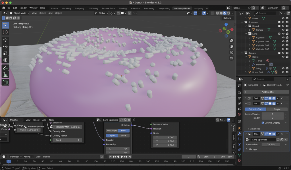
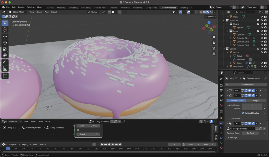
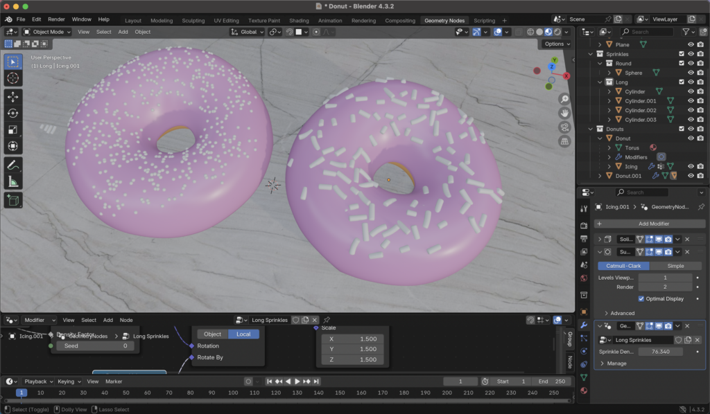
Today I was able to add long sprinkles to my Blender donut! Once again, this was not a simple a task as it seemed it would be. I started by creating a cylinder mesh, which is pretty standard by now as it’s just hitting Shift+A and selecting the option in a drop-down menu, but I then learned how to bevel it to remove the unrealistic, sharper edges. Selecting the top and bottom faces in Edit Mode, I hit Ctrl+B to round out the edges of my sprinkle. I then duplicated it (Shift+D) three times to create a shorter one, a longer one, and a curved one. The curved one was a bit more complicated as I had to add a deform modifier to the cylinder and bend it to the degree I wanted. In this process, I also learned how to move the origin point of each object to their centre (which makes the object rotate around it’s centre rather than above or below it, which Blender Guru says is basically the shape’s “centre of mass”). Below, I’ve included a picture of my sprinkles before being added to my donut!
Sprinkles and my COLOSSAL donut
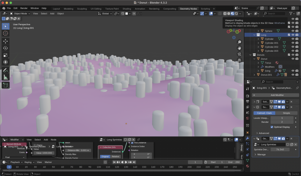
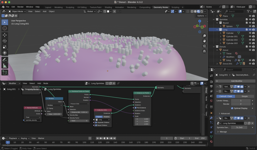
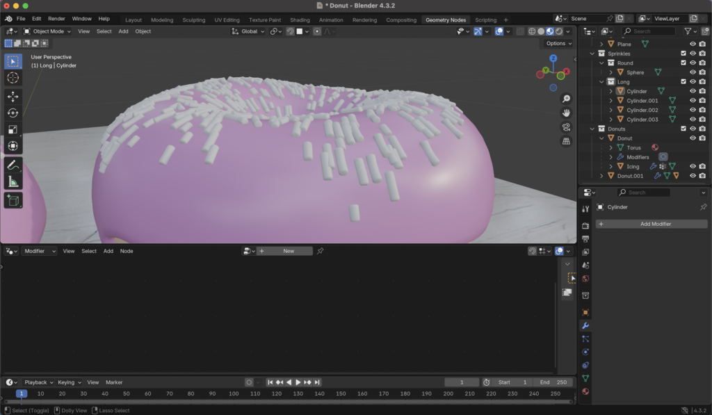
Actually applying the long sprinkles to the donut was an… interesting process. I’ve documented my progress below with screenshots to show you each state of the sprinkles on the donut, which I found kind of entertaining.
“Sprinkle City,” replacing the spheres with the cylinders on a duplicated donut without any modifications made them look like tiny little skyscrapers in a weird, pink valley.After adjusting their rotation to be relative to the icing, they looked like a type of mould or fungus growing over it.After rotating their source cylinders 90°, they lay flat on the surface of the icing, but still appear… uncanny.Playing with their rotation a bit, they begin to look like wispy hairs.More rotational editing. This makes them look like a whirlpool of sprinkles, which is cool, but not what I’m going for.
After adding a node allowing for randomized rotation, I made the sprinkles slightly bigger and ensured the minimum distance from each one was also slightly bigger due to this size increase. Finally, I ended up with this:
My two donuts!
Below is the linked video that I used for this part of the tutorial!
Today, I added sprinkles to my donut. This sounds like it would be a relatively simple procure, but the process to get there included quite a number of steps. This involved using geometry nodes, similar to the nodes used for textures, but designed for altering geometry and 3D forms instead. Using a scatter feature, I was able to create a simple sphere and “scatter” it along the surface of the icing. I was able to alter the size of the sprinkles, the amount of them, and the distance they sit apart from each other for as little clipping as possible. While this sounds all well and good, the sprinkles were scattered along every surface of the icing rather than just the top. This included the “drippy” parts and the underside of the icing as well.
The underside of my donut’s icing. Looks like some kind of alien nest.
Using a feature called weight paint, I was able to paint on my icing where I wanted the sprinkles to appear. I was then able to further limit the amount on the donut. Following this, I scaled the donut down in size as it was currently about 1.5m long. That is far too large for a donut, and while the size wouldn’t seem to matter when making just a single donut, it is good practice to keep things at an easy-to-reference uniform scale when 3D modelling for when other materials and forms are added to a scene.
While this is a shorter update, there is more to come as next time I learn how to put cylindrical sprinkles on my donut! Below I have attached a picture of my process and Blender Guru’s tutorial that I followed for this step of my Blender journey.
Today I was able to colour my donut and modify the textures and lighting to something a bit more realistic. I followed the next part in Blender Guru’s tutorial series to do this.
I learned a lot about texture today, and how texture typically works in 3D modelling. For the countertop that would hold my donut, I downloaded a texture from a 3D modelling reference website called Poliigon. This site was designed by Blender Guru and is a massive library for textures, models, and other 3D modelling assets. The resources here are available for use by 3D artists and animators and they are designed to match the industry standard. Many resources here are locked behind a paywall but there is a fairly massive free library available for use. While textures can be found on Google Images and other websites, they are usually consolidated into a single image. The textures available on Poliigon have multiple layers that are more designed for 3D modelling than flat images, which are typically used for 2D art and websites. Below, I’ll go into some detail about the texture I downloaded.
The texture I downloaded as part of the tutorial, for my countertop, was called “Denali Polished Quartzite Stone Texture, Gray” which downloaded as a .zip file and came with 5 layers.
From left to right, the layers are as follows: Base colour (main texture), displacement, metallic sheen, bump map, and roughness. All of these textures, while all five don’t particularly need to be used at the same time, combine to make a marble countertop texture that properly reflects light and has subtle chips, dents, scratches, and fingerprints on its surface.
The base colour texture for “Denali Polished Quartzite Stone Texture, Gray”
If I wanted to modify any of my texture, such as roughness or lighting, I can use the texture nodes available in the shading window.
The nodes can be seen in the lower half of the image, and can be moved around that window
I also learned how to make my own textures by adding a material to what I want to texture and then hitting “new” instead of “open” which would allow me to import a downloaded texture. In a new window, I selected a brush type and could draw directly on the donut. I drew the lighter line that would go across the centre of the donut (from when it bakes in real life and is not as dark as the top and bottom of it). Below is my created texture and the final result of the day’s progress.
My donut texture
I’ll also link the video tutorial I used in these stages for reference.
Today, a School District 61 teacher, Kristen, came in and talked to us about incorporating technology into outdoor education. One of the questions she asked us was what kind of technology we as teachers can use to help students foster a healthy relationship with the land. Some apps, programs, and websites that she recommended, along with some we came up with, are as follows:
We also touched on a few other things such as using cameras, educational videos, livestreams of forests, aquariums, eagles’ nests, and more. Another way I thought of using tech in this regard is by using VR, possibly for virtual field trips. This would be fun, however, even affording one VR headset for the classroom would be quite costly at this point. As a result, this would likely be at a point in the future when there are cheaper options available for classroom use.
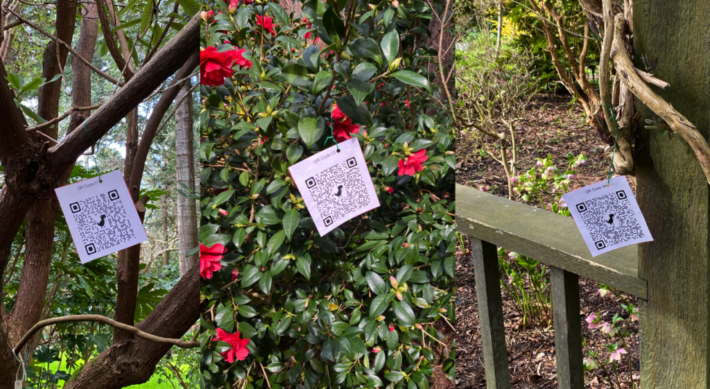
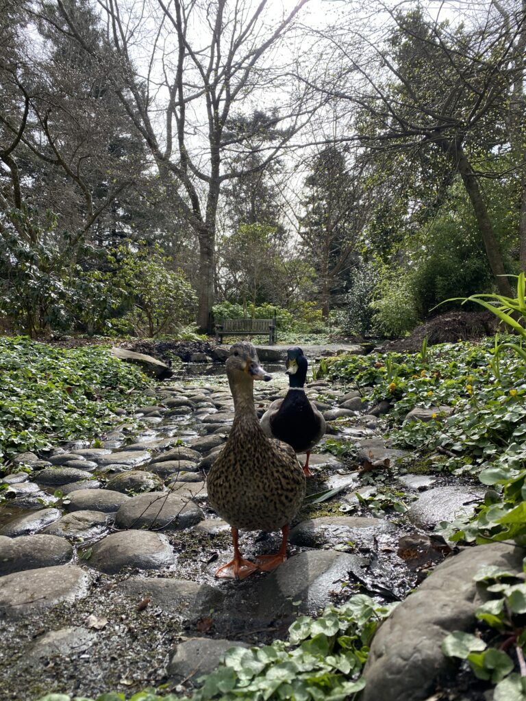
Following a brief presentation, we took the class outside into Finnerty Gardens for a scavenger hunt created for us by Michael. He had us find six QR codes placed by him that linked to different topics and videos connected to outdoor education and Finnerty Gardens. This would be a great activity to bring into the elementary classroom if we distributed devices that could scan QR codes. It would connect outdoor education with technology and be an engaging way for students to learn the material. If I were to do this with a class, I would make it so the students had to interact with and engage with the links in the QR codes for it to count towards their scavenger hunt. I fear that some students would run through the garden to get every QR code in the scavenger hunt without engaging with the resources simply so they could be the first to complete it. Overall it was a fun experience to work with my group! Below I’ve included pictures that I got in the gardens along with some examples of the QR codes.
Some QR codes posted by MichaelSome very friendly ducks coming to say hello!